We all whinge and whine about ink prices but here's a thought. I've just been reading about Coca-Cola concentrating on white, rather than on its all-too-familiar red in its latest campaign, to support polar bears and the WWF. And this led me to ponder how much thought is put into the ink usage during the branding and design process.
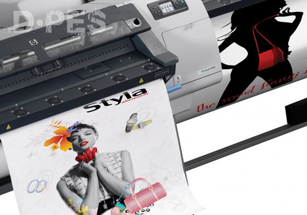
Colour attracts attention. Traditionally, the brighter and more garish the shade the more difficult it is to miss. Bright brands created for television or for digital signage don't come with a price penalty for the producer. But where a PSP has to use lashings of ink to match a specific scheme or theme, the chances are that the designer of the job never gave a thought to the actual cost of seeing his creative efforts appear in print.
So the question is, do we need all this ink to generate the required reaction generated by promotional print? When Marks and Spencer created its new look which took it away from the familiar green as its primary background, sales didn't plummet and, whether it was intentional or not, lightweight graphics on white actually encourage more of an eco-friendly appearance.
But other brands continue to rely on strong colours, hanging onto the shades with which the public has become familiar during the decades. Are those which rely on their promotional print to favour a dense, dark background really creating greater impact than the retailers in today's world who might have considered that non-printed areas of a graphic not only save on production costs but also have visual appeal?
Although coloured substrates are used for many applications, and corporate shades are produced in bulk for customers, across all print media these are still in the minority and white continues to be the most common base material. Likewise, an order for a display or sign might contain total coverage of the material, or a percentage that only represents a small fraction of print.
Everyone is aware of the power of colour as a communications tool. It creates moods according to shade, and denotes the nature of the product or brand it is being used to promote. It also needs to be consistent across all media, from the web through digital signage to the printed product.
So will the move to cleaner, crisper graphics generally see more use of white as a base upon which other colours sit? Brands don't need to lose their corporate shades, but if their wide-format printed work involves less in the way of ink then, surely, that must be good for everyone wanting to save on production costs.